True North Food + Music Festival
tn_logo_ivory.png
2026 Campaign
Brand Reference · Provided by Big Sis Creative Studio
Everything needed to produce True North 2026 campaign materials. Share with any vendor, designer, or partner working on the campaign.
Primary lockup uses Breakers Slab Bold + Gin. All colorways are print-ready artwork — never recreate the logo, always use provided files. All colorways available for download via the colorways folder.
Three primary colors carry the full campaign. Mint and Dark Teal are secondary — backgrounds, accents, and decorative applications. Print specs (CMYK/ink type) are in the campaign guidelines PDF.
Breakers Slab Bold + Gin are the primary logo fonts, available via Adobe Fonts (CC subscription). Hatfield Park Stamp is the festival script — used sparingly, all instances outlined. Knockout covers supporting display needs. All print type will be outlined in final production files.
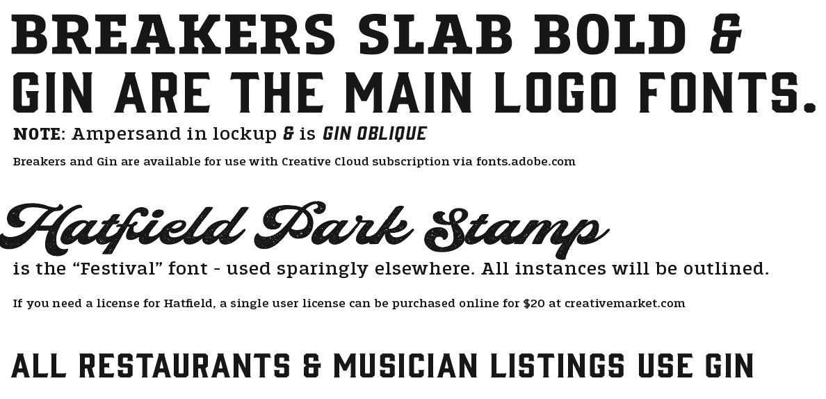
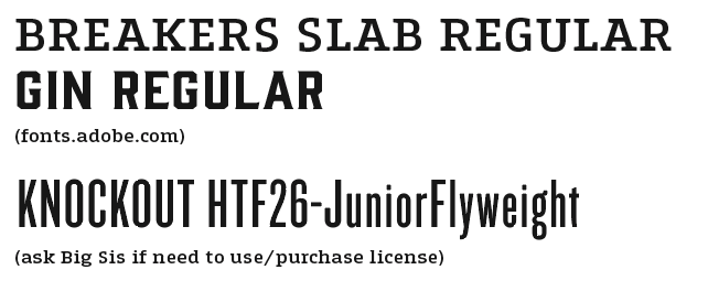
All fonts requiring a license have been outlined in the working files — no additional software is needed to open or print production files. Breakers Slab and Gin are available via Adobe Fonts (fonts.adobe.com, CC subscription) for any new production work.
Two distressed texture files cover the full campaign. Use the blue ground for primary event collateral. Use the ivory ground for menus, programs, and lighter-field materials.
Decorative elements for layout use: bookend rules, triangle divider, secondary pennant flag (mint), guitar pick (gold), and vertical linework. All provided as vector artwork in the campaign files package.
4:5 digital format for Instagram. Sized and optimized for the May 12 announcement. Use this file for all social posting — do not crop, resize, or recompress.
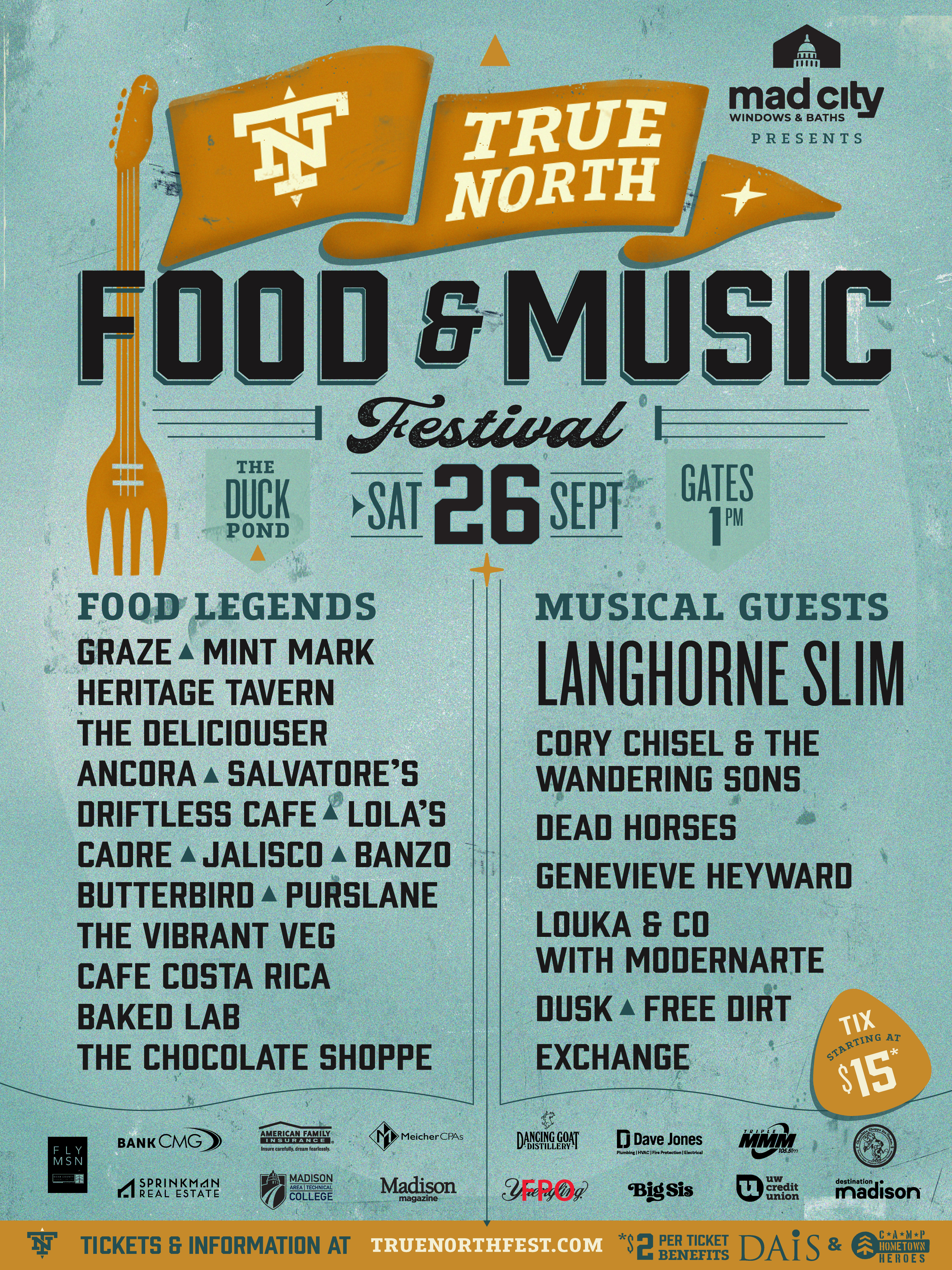
Selected direction, client feedback, and iteration review.
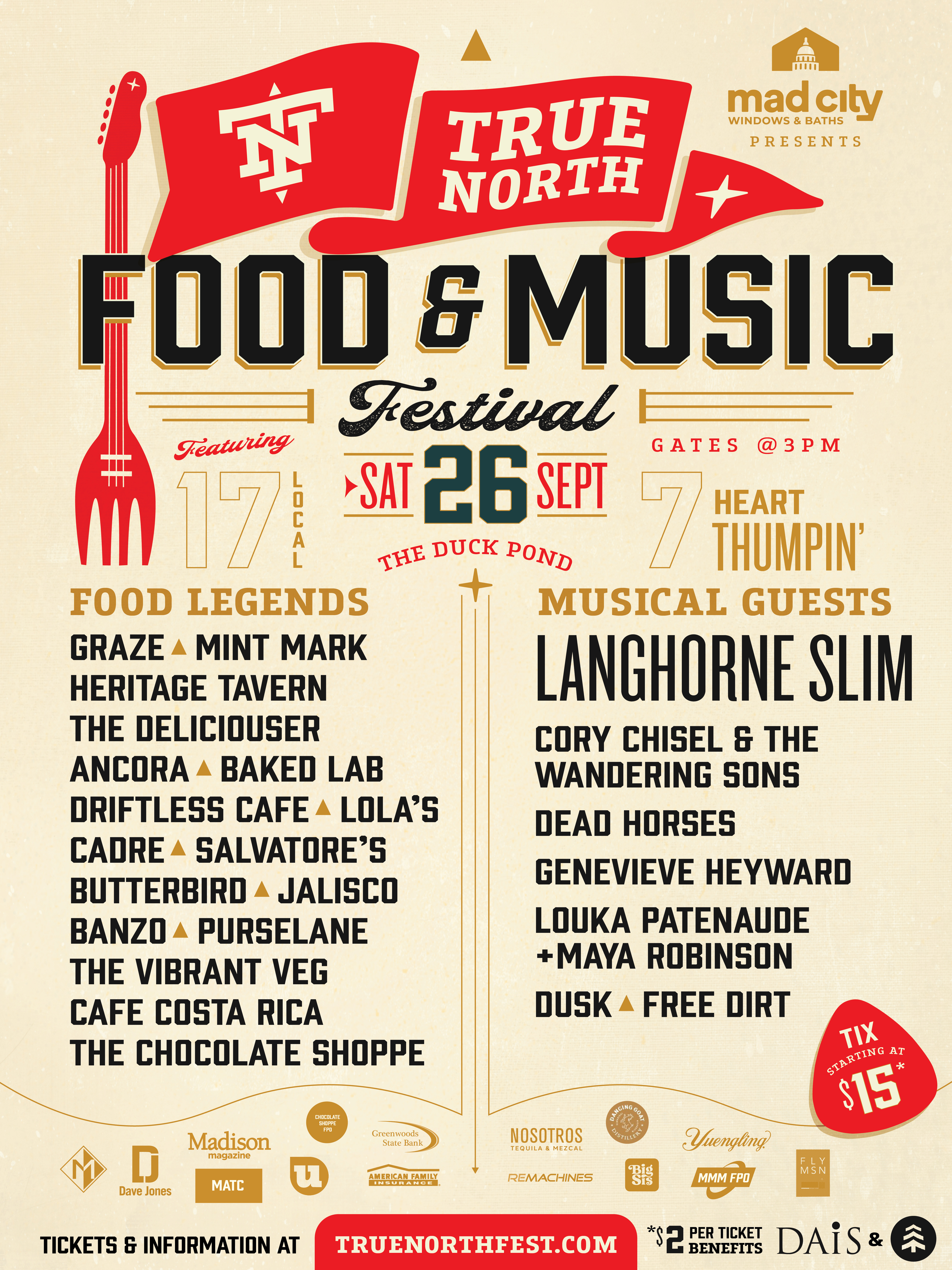
Selected Direction
After working through the iterations, the strongest direction is to stay within True North's established color system — added a subtle bronzy-gold in one iteration for depth. Pushed on a few with a blue background; also dabbled in using dark green as a highlight, but none of those versions outperform the original palette. There's also a practical upside: keeping last year's colors means the website and existing signage don't need to be rebuilt for year two. Tested a stacked horizontal layout with food above and music below — the volume of restaurant names creates too many lines of centered type, which adds visual noise and loses hierarchy at the margins.
Click any thumbnail to view full size.
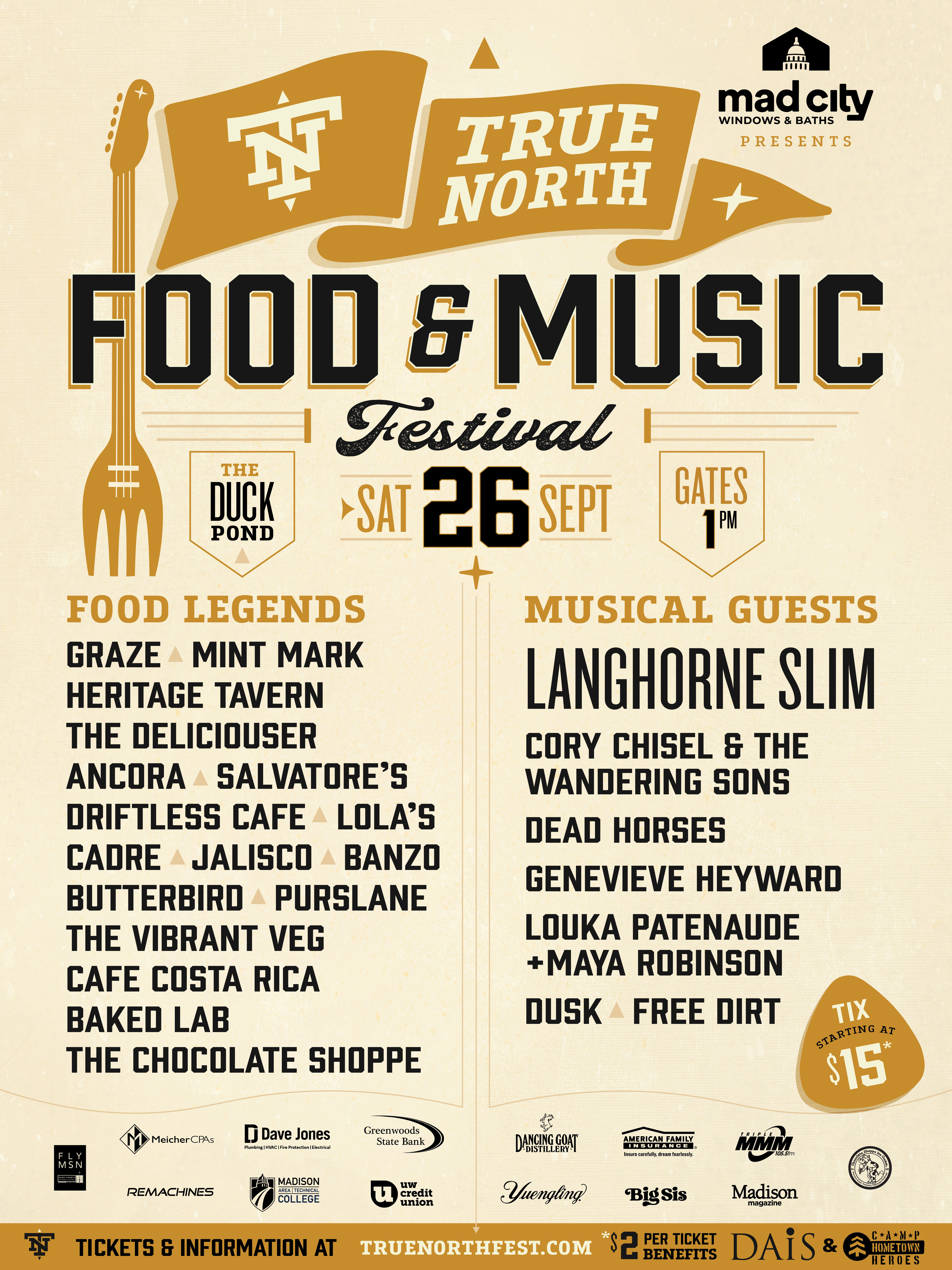
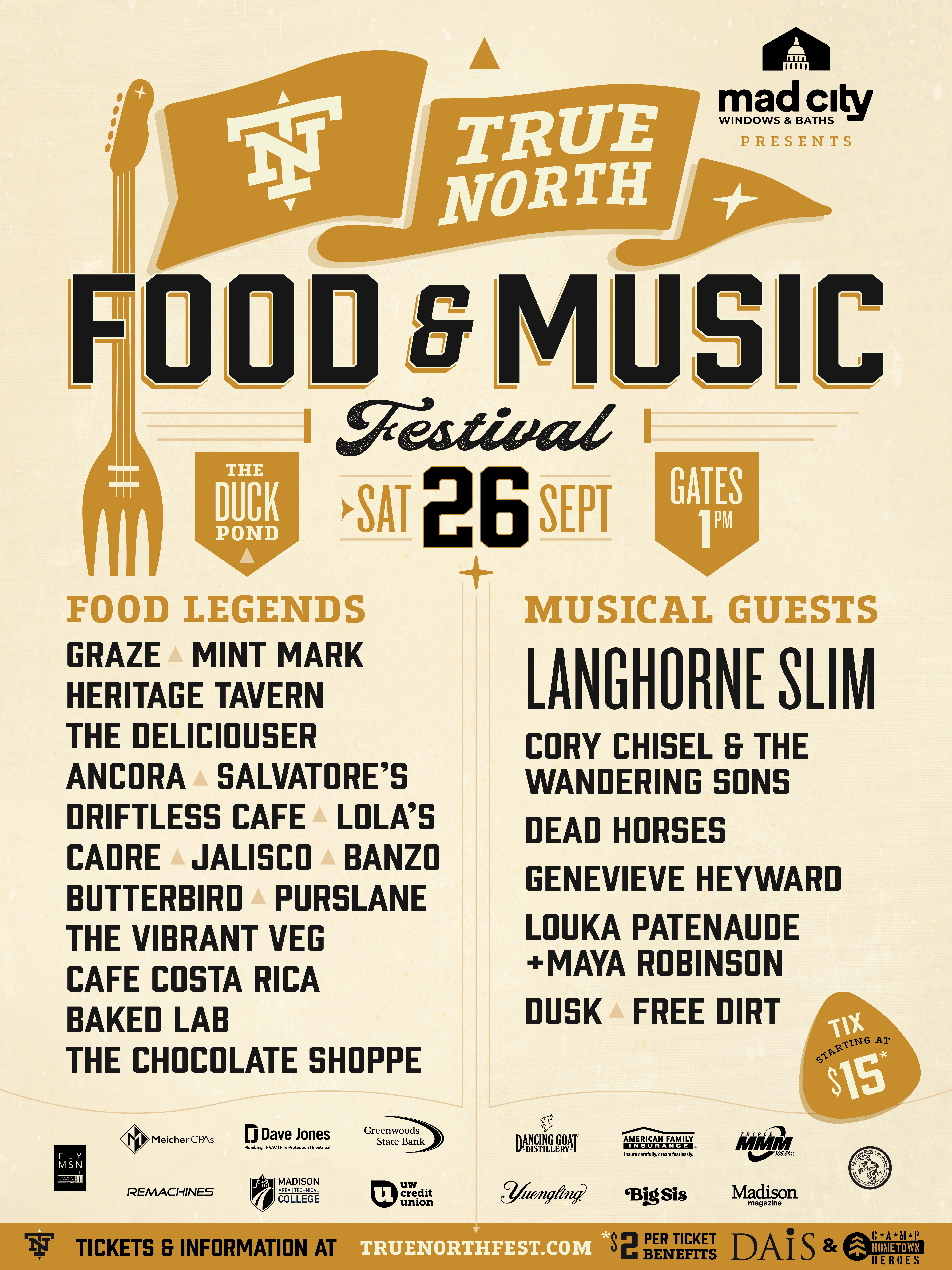
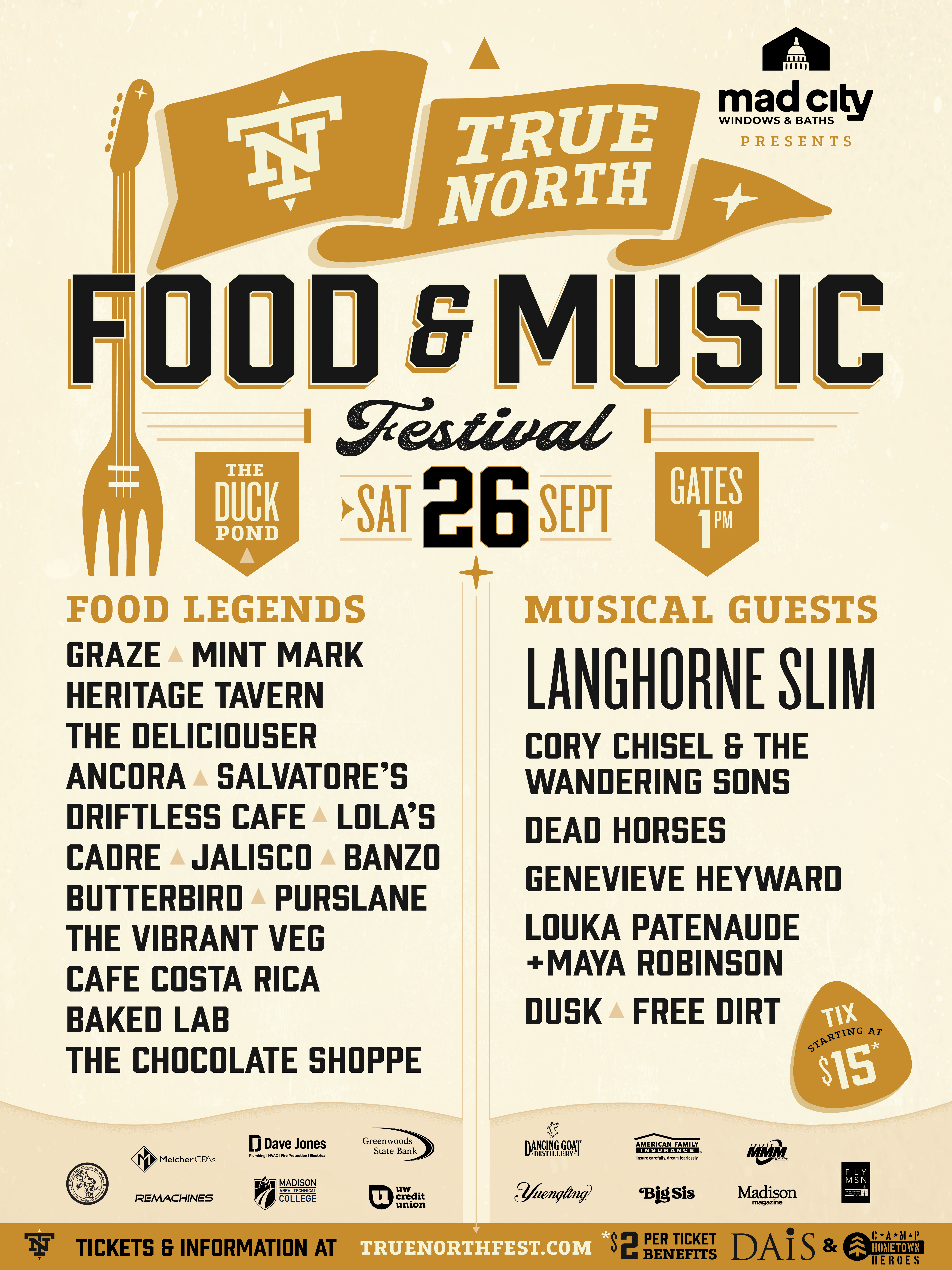
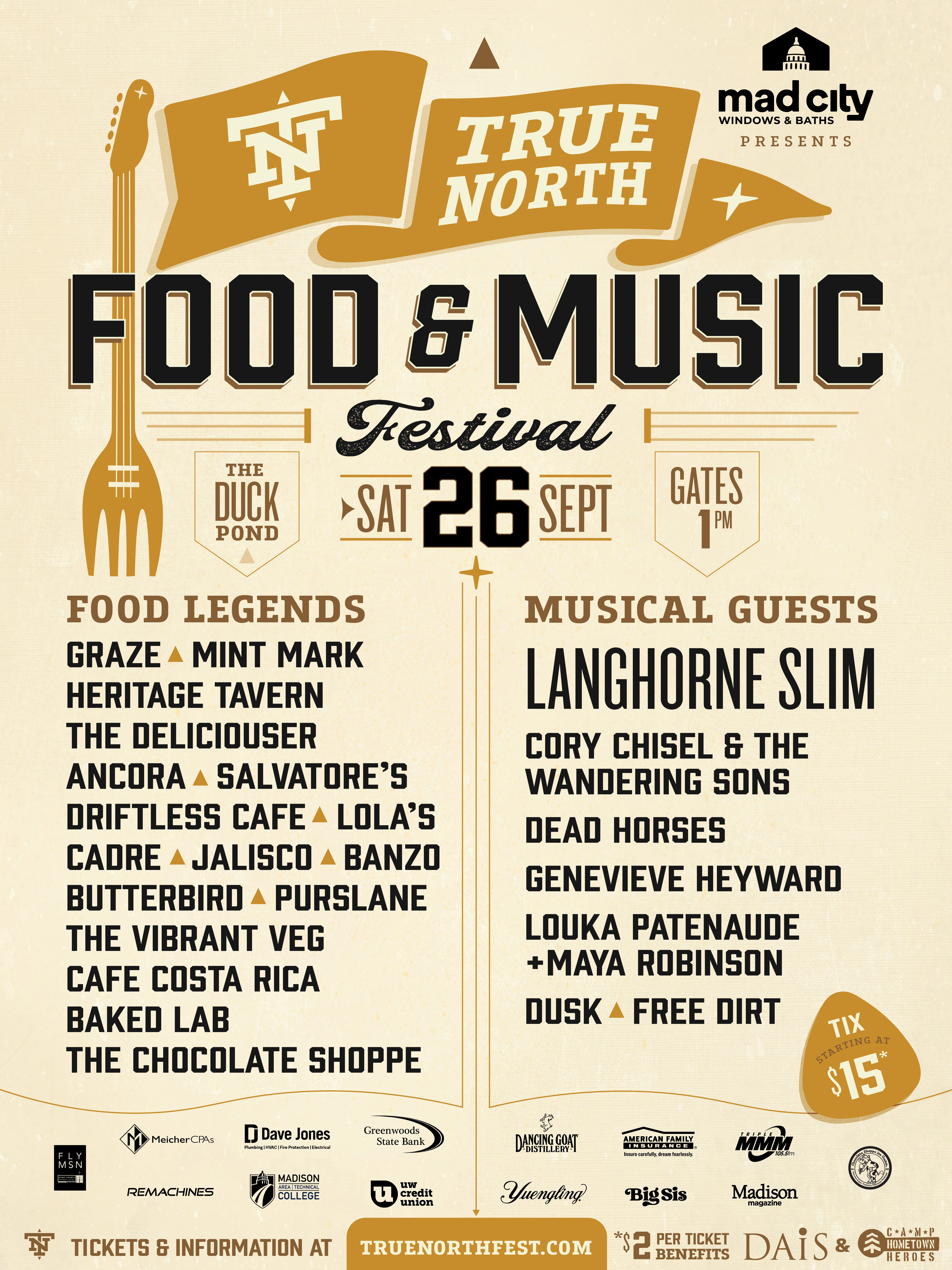
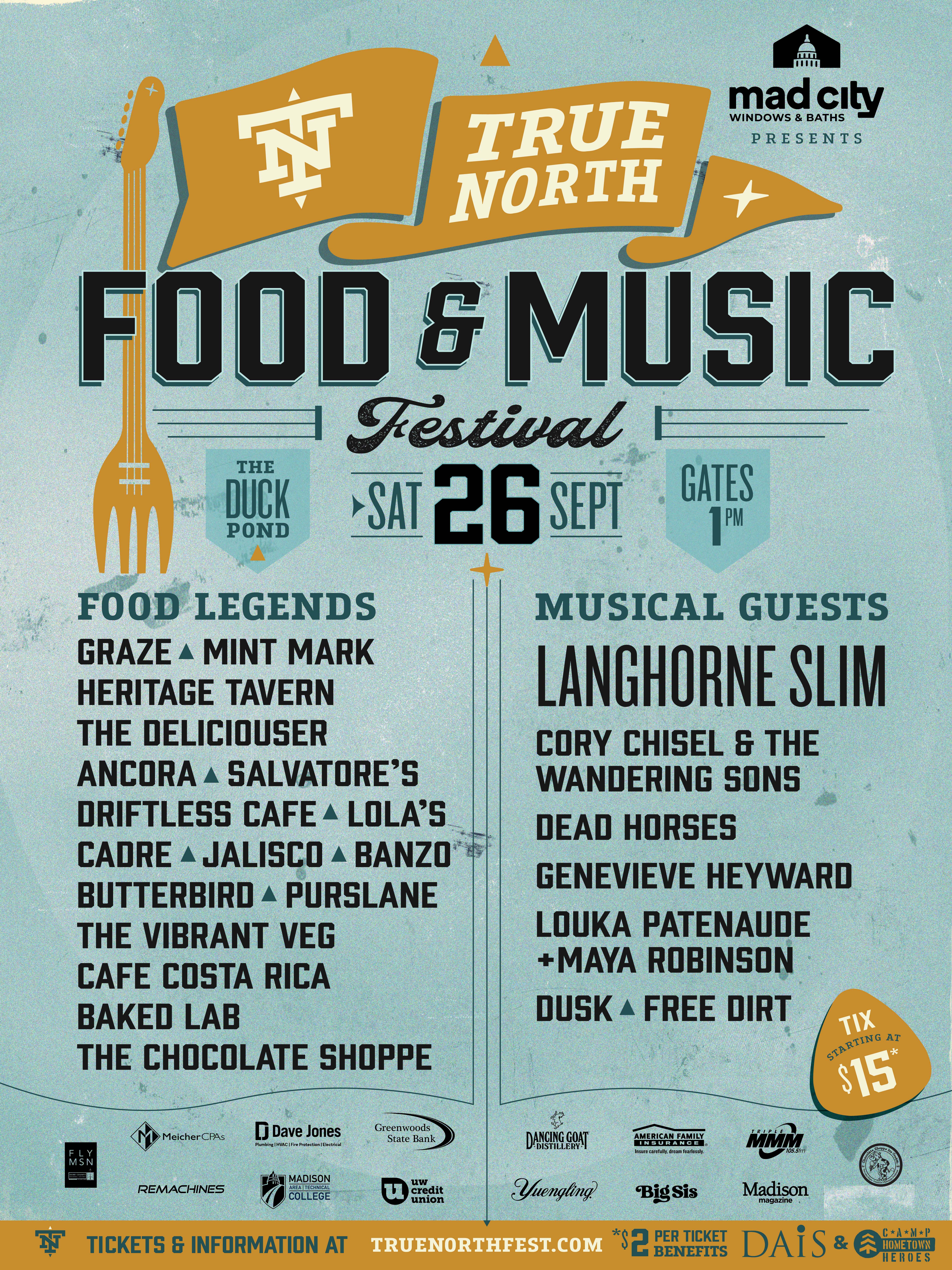
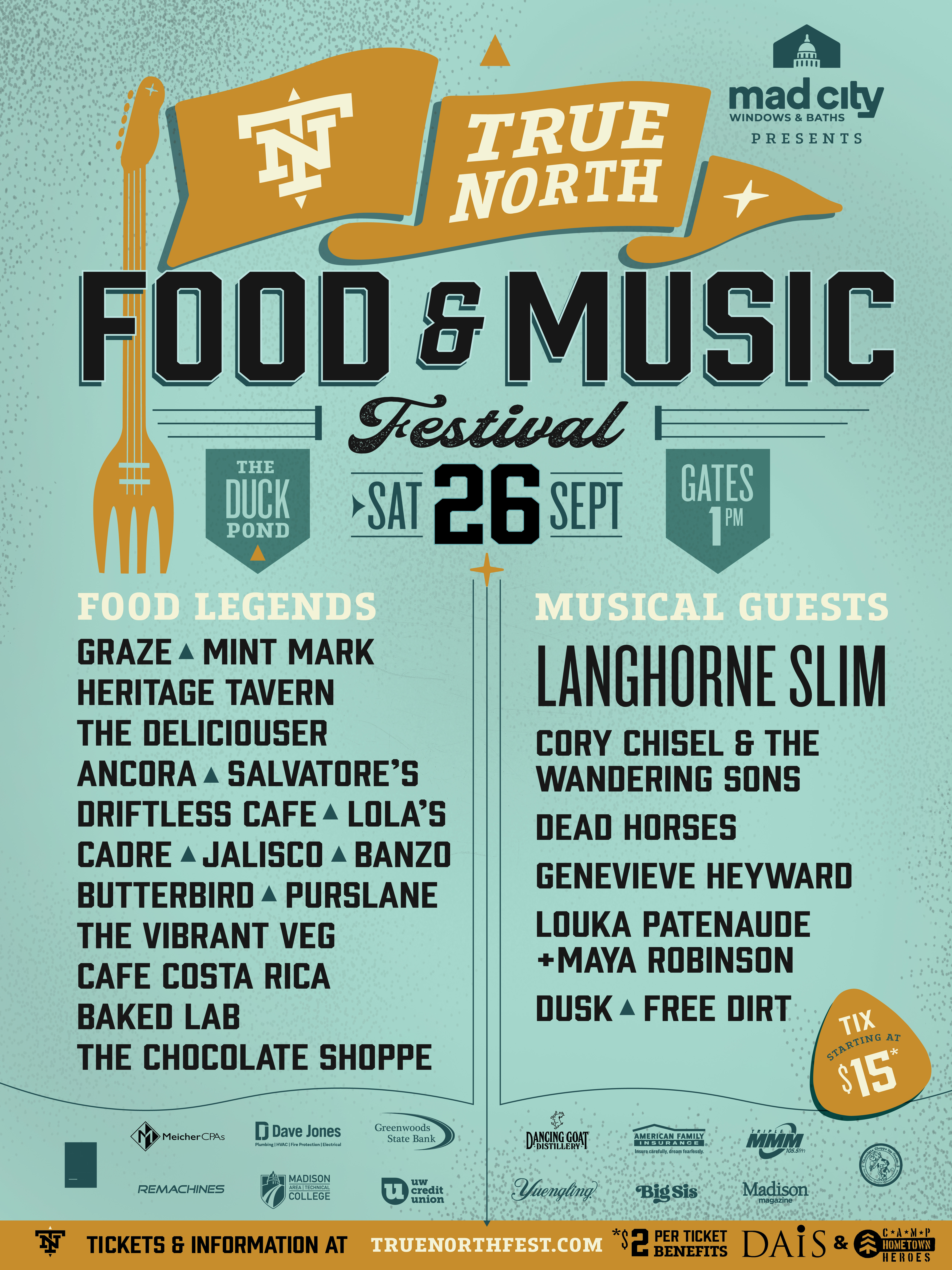
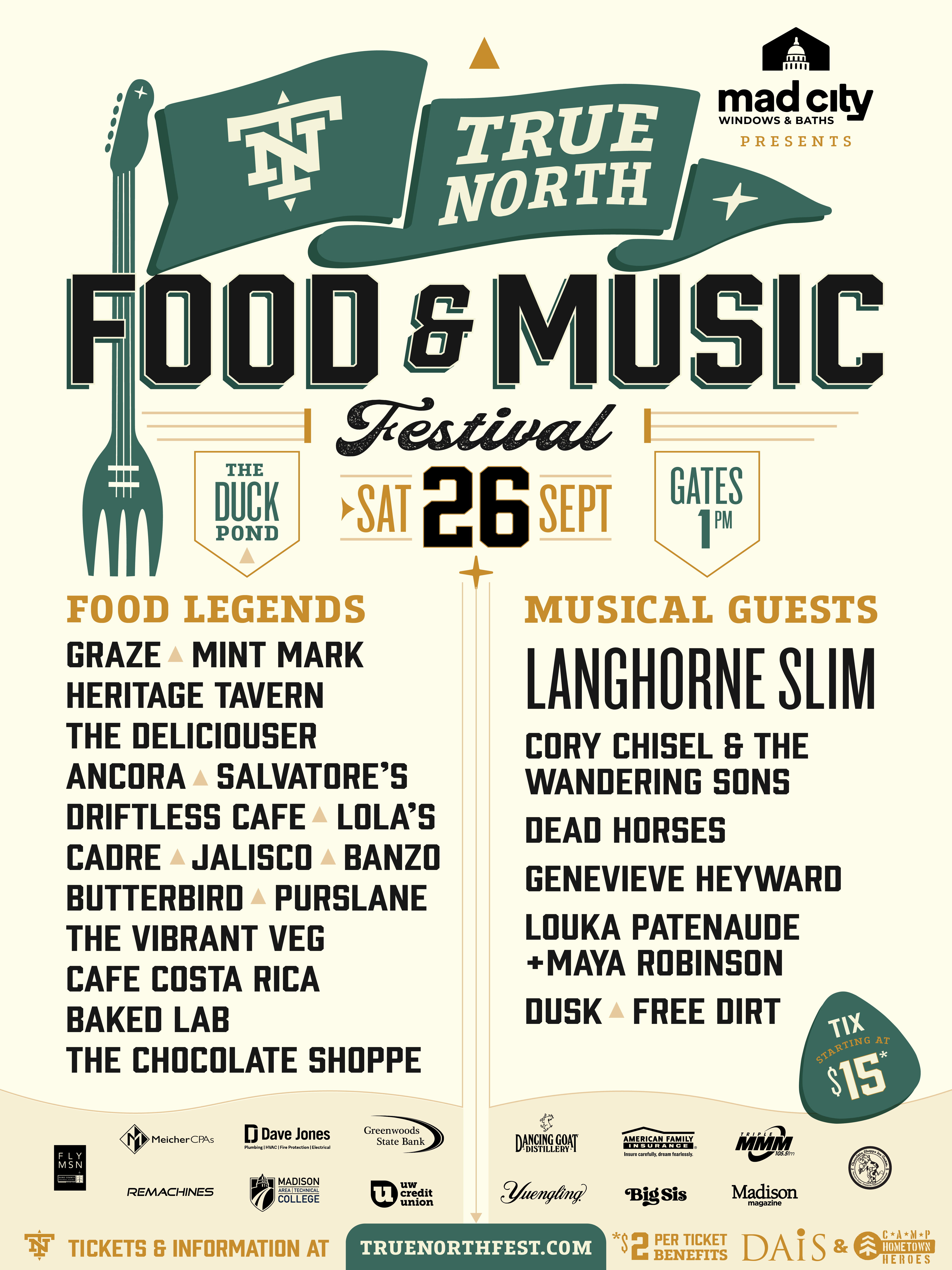
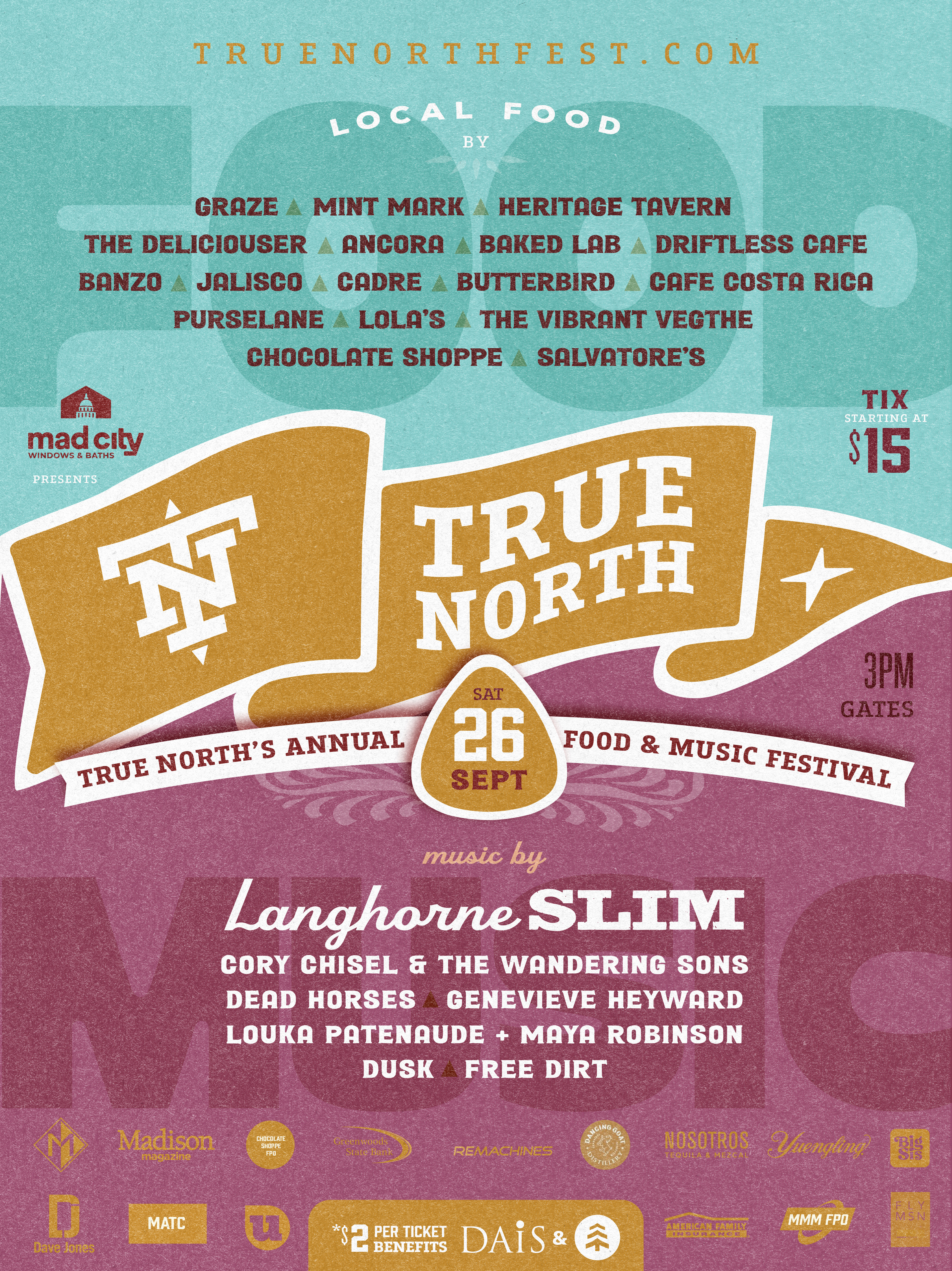
True North is heading into 2026 with a bigger lineup, a stronger food story, and a cleaner design vision. Big Sis came in to elevate the poster and set the visual tone for the full campaign.
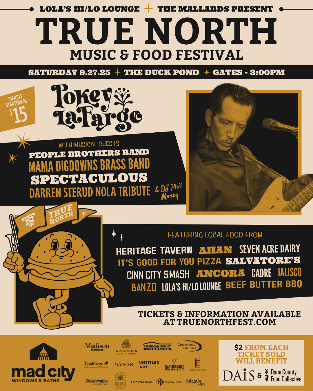
True North 2025 · Pokey LaFargo headlined. Building on the brand — year two evolves the visual system.
Year two evolves the True North visual system — pushing the color palette to differentiate from 2025, giving more weight to the food side of the festival while keeping the core mark system intact.
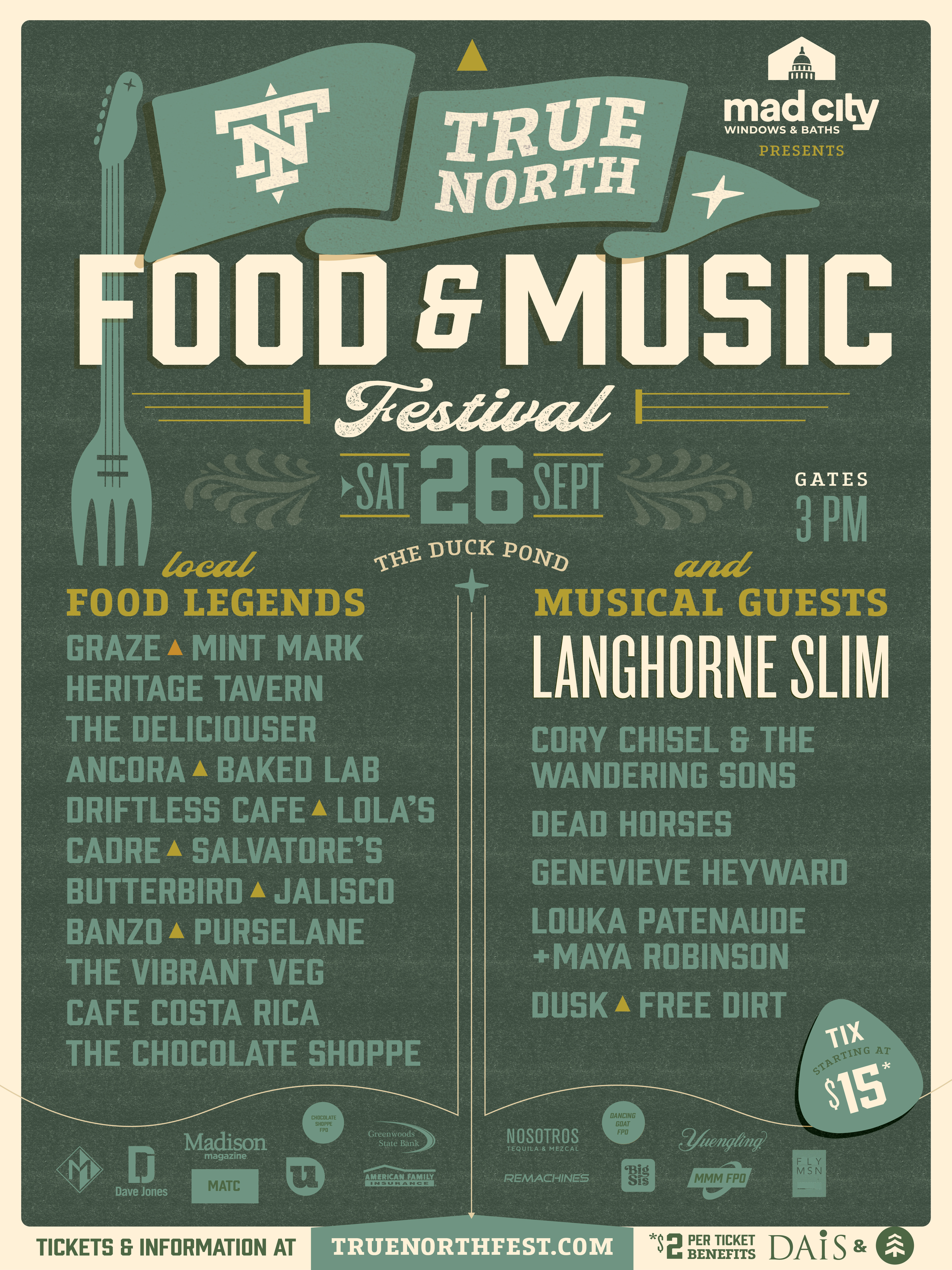
Builds on the True North mark system while pushing the color story. Food and music carry equal weight. The flag pole gets an update — the fork guitar appears as a way to visually bridge both sides of the festival.
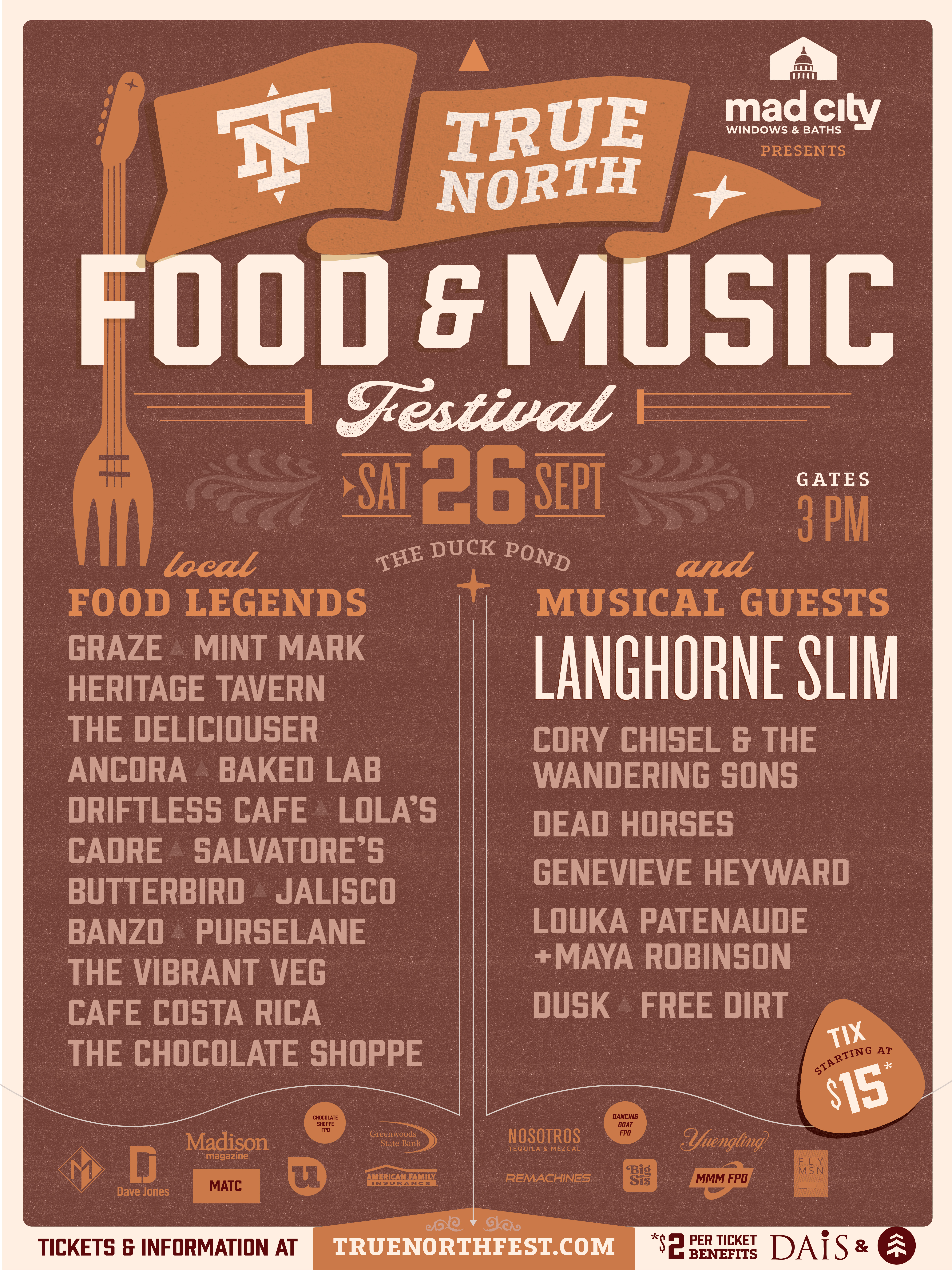
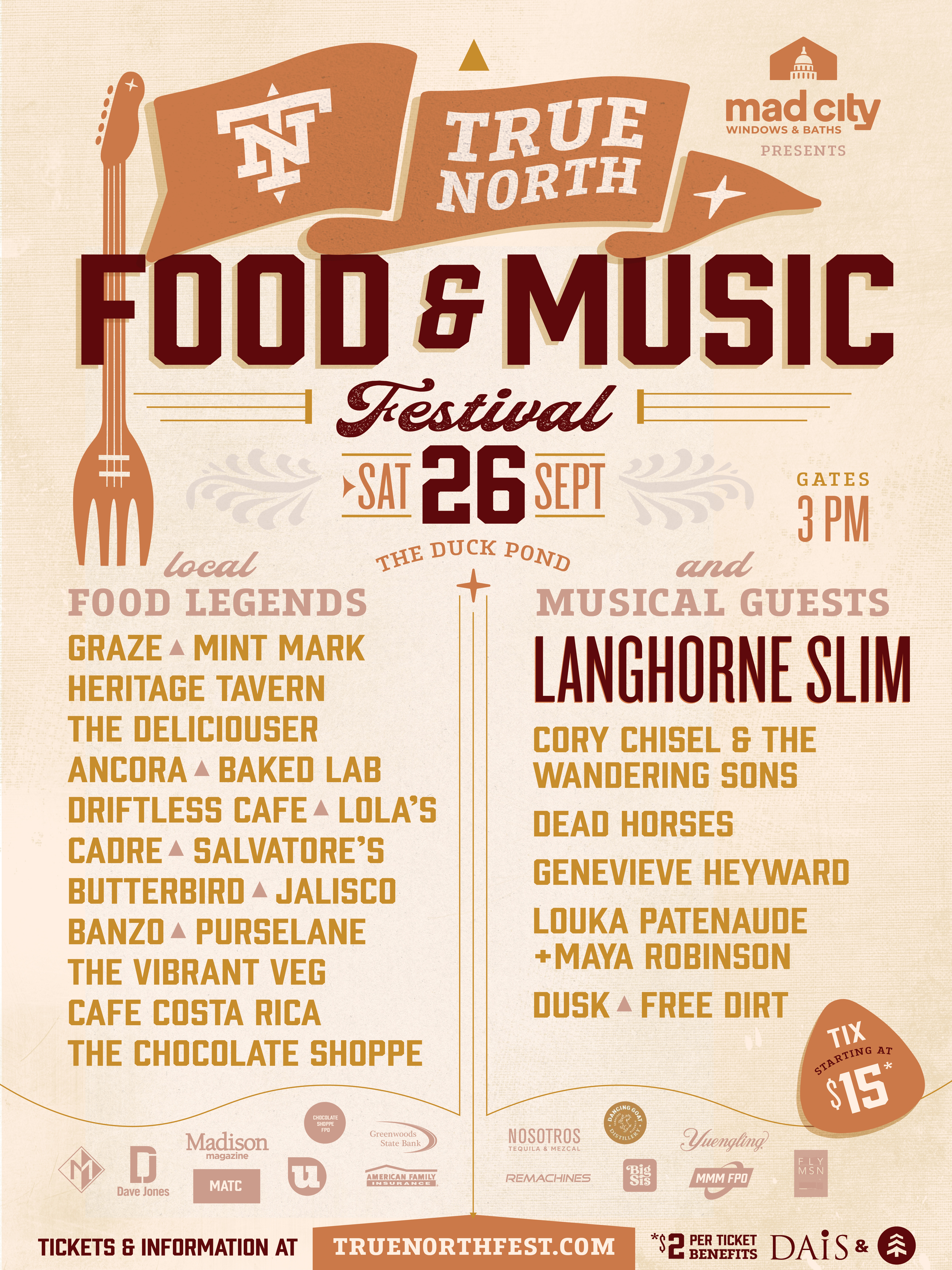
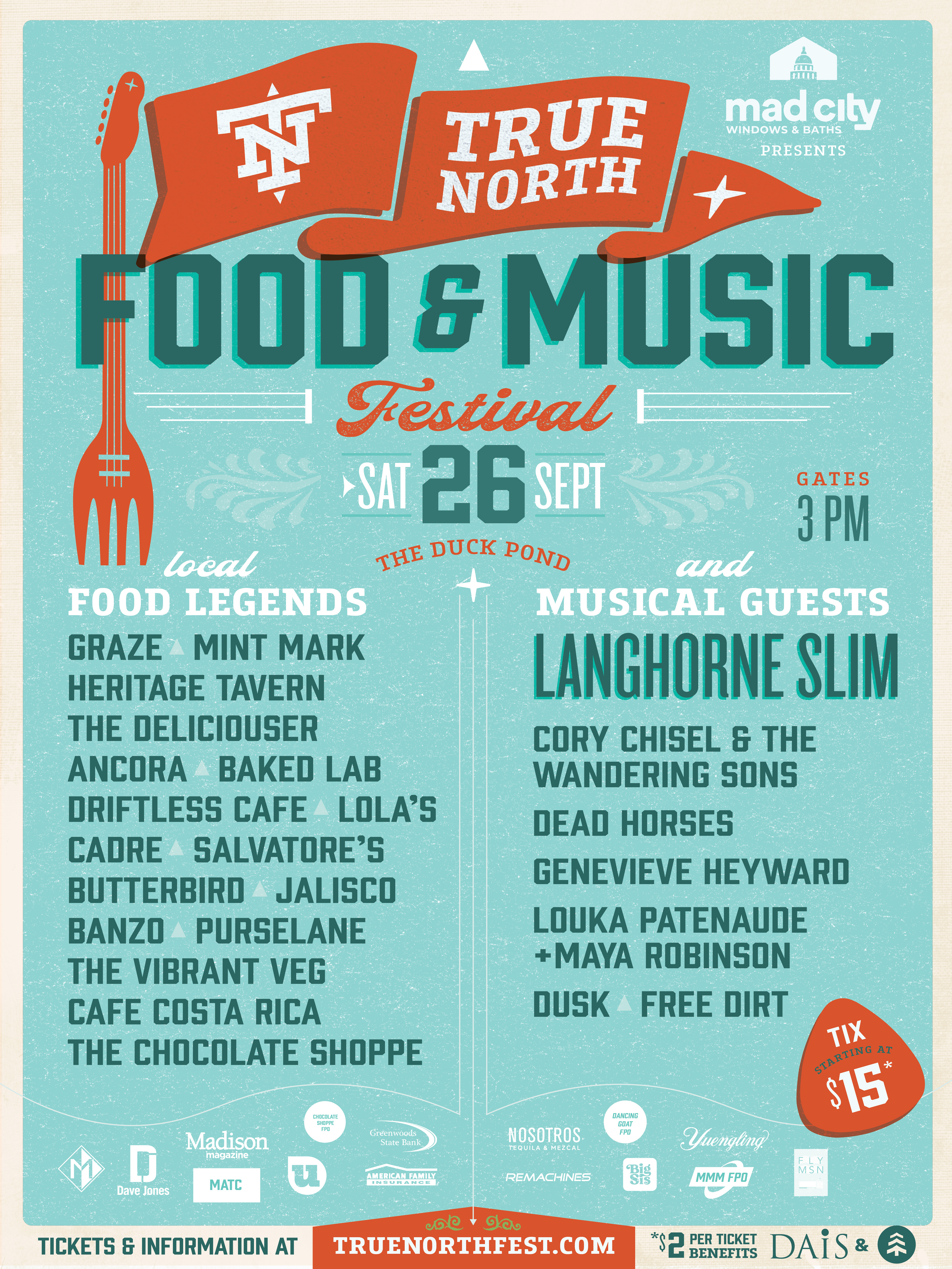
Explores whether the mark stands on its own — no flag pole update, no fork guitar. The logo anchors both sides of the festival, bridging food and music through placement and hierarchy rather than illustration. Pulls gold from year one; richer, deeper tones signal year two's evolution.